Meadow
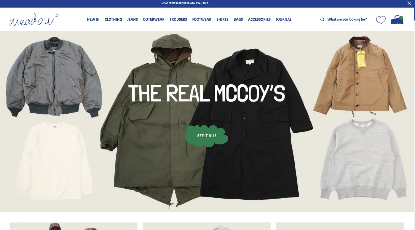
Fashion e-commerce redesign
Redesigning the entire shopping experience to improve conversion while preserving the unconventional character of the brand.
The challenge
Meadow already had something many e-commerce brands struggle to build — a distinctive personality. Its unconventional visual style made the store recognizable, but the shopping experience itself created friction, particularly around product discovery and the path to checkout.
The challenge was to improve the commercial performance of the Shopify store without removing the quirks that made Meadow feel like Meadow.
The goal was to redesign the entire website, make shopping clearer and more intuitive, and modernize the visual experience while preserving the brand's distinctive character.
My role
I worked on the complete UX and UI redesign of the Meadow e-commerce website, covering all key pages and stages of the shopping journey.
My work included rethinking the catalog experience, filters, product presentation, shopping cart and other core e-commerce interactions, while also developing a refreshed visual direction for the website.
The redesign was created as part of a wider team effort. I collaborated with other specialists, including an illustrator, to bring the updated visual language to life while keeping the experience functional and conversion-focused.
What I changed
01Balanced usability with brand personality
Rather than replacing Meadow's unconventional identity with a generic e-commerce aesthetic, the redesign focused on finding a balance between character and usability. Typography, color, layouts and illustrations were refreshed to create a more contemporary experience while keeping the distinctive details that made the brand recognizable.
02Made the catalog easier to shop
Redesigned the catalog around clearer product presentation and easier visual scanning. One of the key changes was moving away from the previous yellow catalog background toward a cleaner product-focused environment, allowing product colors, details and materials to stand out more clearly.
03Improved product discovery
Introduced more user-friendly filtering and clearer product states to reduce friction while browsing a large catalog. The experience also included wishlist functionality, sold-out states and interactive product cards, giving users more useful information and actions directly while browsing.
04Rethought the shopping cart
Designed a faster and clearer pop-up cart so users immediately understand what happens after adding an item. The cart allows customers to adjust quantities, remove products and explore related items without interrupting the shopping journey, creating a smoother transition toward Shopify checkout.
05Redesigned the complete experience
Rather than improving individual screens in isolation, the project covered the full website and created a consistent experience across the customer journey. Pages, components and interaction patterns were redesigned as parts of one system, creating stronger continuity from browsing and product discovery to cart and purchase.
06Refreshed the visual system
Developed a new visual direction through updated typography, color palette, UI patterns and supporting illustrations. The result was intentionally not a completely new Meadow, but a more polished and contemporary expression of the same brand personality.
The result
The redesign gave Meadow a more focused e-commerce experience while preserving the unconventional personality that distinguished the brand in the first place.
Product discovery became clearer, the catalog placed greater emphasis on the products themselves, and key interactions such as filtering and the shopping cart were redesigned around a smoother path to purchase.
Most importantly, the project demonstrated that improving conversion doesn't have to mean designing away a brand's personality.





Your idea.
Let’s make it happen
Tell me what you’re working on — I’d love to see what we can make